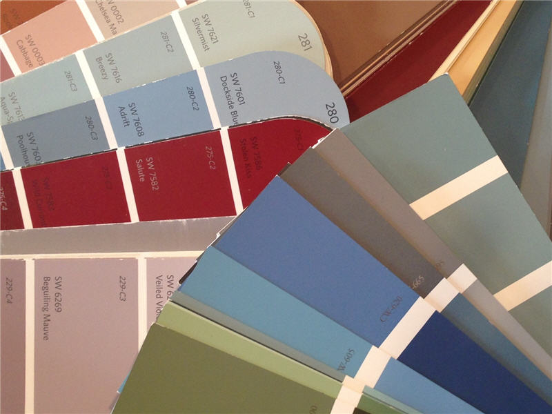
Each New Year brings new color forecasts or “Color of the Year” updates from paint companies such as Benjamin Moore, Sherwin Williams, and Pratt and Lambert. Although I don’t always embrace or follow “Colors of the Year,” I find 2018’s featured colors, color trends and color forecasts very interesting and encouraging. Seems like paint color trends and forecasts are moving towards rich, bold colors that encourage lots of individuality and expression, and moving away from more subdued colors that have been popular over the past several years.
For example, take a look at Benjamin Moore’s color of the year, Caliente. This vibrant red has actually been a long time favorite of mine for residential design projects, especially for family rooms, dining rooms, or dramatic powder rooms. The other colors in the Benjamin Moore 2018 Color Palette introduce a series of warm and cheerful berry tones, plus a very sophisticated series of gray colors which are sure to appeal to clients for homes both traditional or contemporary. I can just imagine how beautiful many of those colors will look combined with painted white trim and millwork, or with dark stained floors.
Sherwin Williams Color of the Year, Oceanside, is just as saturated and intense as Benjamin Moore’s Caliente, and could be a good choice for seaside projects, open and airy interiors, kids’ rooms and playrooms, and for living areas incorporating contrasts of white or gray. Sherwin Williams’ 2018 Colormix Forecast includes a wide range of bright and distinctive colors plus a palette of more subdued, soft colors which should prove to be popular.
Pratt and Lambert’s 2018 Color Forecast features three groupings of bright, bold and dramatic colors plus one group of more subdued, “restful” options that still provide plenty of distinctive color. Each grouping and their colorful descriptions are fun to check out, too!
Putting together color schemes for residential or commercial interior design projects is one of my areas of specialization. I help with the color selection process on many projects every year. It can seem daunting for clients at first, but becomes both fun and logical once we get started. Looking forward to using many great looking colors in 2018!

