
I can’t believe that 12 months have flown by since I wrote a blog about Color of the Year for 2019. So now it’s January 2020 and it’s time to take a look at Color of the Year from paint companies such as Benjamin Moore, Sherwin Williams and C2 Paint. I also enjoy checking out Pantone’s Color of the Year and the philosophy and thought behind the selection.
Although I’m not a proponent of trendy or short-lived design options, I enjoy brushing up on Color of the Year just to stay current with paint companies’ suggestions for color. Some years, I love the choices that paint companies put out there, and some years I’m not too keen on them. This year is a mixed bag. Blue is the dominant color this year (and blue has been very popular the past year or two for everything from painted kitchen cabinet finishes to upholstery fabrics to area rugs, both traditional or contemporary). Sherwin –Williams, C2 Paints and Pantone have all selected a blue color as Color of the Year. Out of the three blues, I definitely think C2’s Salty Brine is the most useable for interior design paint applications. It’s a great choice for coastal homes, for classic New England colonial homes and interiors, and for airy contemporary lofts. It’ll look great juxtaposed with crisp white millwork or trim.
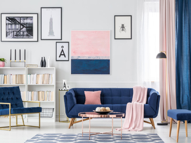
Sherwin Williams’ Color of the Year – Naval – is a beautiful blue that will also look great paired with white millwork, with traditional Oriental rugs, and with Carrara marble or quartz counter tops. For people who love blue, it’s a hefty color that’s bold without being too bright. As a side note, I also enjoy Sherwin Williams’ annual Color Forecast. It’s a fun way to check out recommended color combinations and themes.
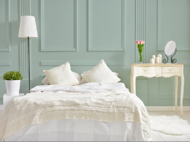
As a contrast, Benjamin Moore’s Color of the Year is “First Light,” a soft, wispy pink. Although it’s a beautiful color, I’m not sure how often I’ll recommend it for upcoming projects or for interior paint schemes. It could work well for dining rooms, bedrooms or bathrooms. For bathrooms, “First Light” would work really well with light gray tile or Carrara marble tile. I really like Benjamin Moore’s Color Trends 2020 Palette, and I spec several of the colors in the palette pretty frequently, including Buxton Blue, White Heron, Cushing Green and Oxford Gray.
An interesting and uplifting note – many of the descriptions for various Colors of the Year mention optimism, serenity, confidence and hope. I love C2’s description of Salty Brine: “Like water, it is fluid and diverse, carrying organic notes that honor the natural world. This soothing color provides an inspiring backdrop to our search for global solutions that protect the environment, as the focus towards sustainability becomes more of a daily intention. Salty Brine’s complex undertones emit a harmonic frequency to aid in our journey for deeper meaning and purpose beyond material possessions.” A great way to start 2020!
Beautiful paint color “Salty Brine” from C2 Paints. Photo courtesy of C2 Paints
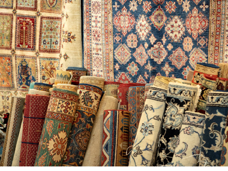
Deep blue wall colors will complement a wide array of Oriental rugs